이질적 처치 효과 : 실무로 통하는 인과추론 학습기(4)

∣
2024년 6월 10일
딥다이브, 실무로 통하는 인과추론 스터디 그룹에서 학습하며 과제로 작성된 글 입니다.
과제 가이드
주어진 데이터를 기반으로 CATE를 계산하고 CATE 예측을 평가합니다. 이때 CATE 모델과 비교하기 위해 머신러닝 모델과 난수 모델을 사용합니다.
모델 분위수에 따른 효과를 파악하고 누적 효과 곡선과 누적 이득 곡선을 그려 모델 성능을 파악합니다.
컬럼 설명
flight_id : 구별 ID
day : 구입 날짜
month : 구입 월
weekday : 요일
weekend : 주말 여부
is_holiday : 휴일 여부
is_dec : 12월 여부
is_nov : 11월 여부
sales : 티켓 판매량
—
분석에 필요한 패키지를 참조했습니다.
import pandas as pd
import numpy as np
from matplotlib import pyplot as plt
import seaborn as sns

import matplotlib

matplotlib.rcParams.update({'font.size': 18})
분석에 필요한 데이터를 로드 했습니다.
data = pd.read_csv("./data_week4.csv")

data
| flight_id | day | month | weekday | weekend | is_holiday | is_dec | is_nov | days_until_departure | sales | |
|---|---|---|---|---|---|---|---|---|---|---|
| 0 | 0 | 2022-01-01 | 1 | 5 | True | False | False | False | 365 | 1.00 |
| 1 | 0 | 2022-01-02 | 1 | 6 | True | False | False | False | 322 | 289.00 |
| 2 | 0 | 2022-01-03 | 1 | 0 | False | False | False | False | 98 | 8454.26 |
| 3 | 0 | 2022-01-04 | 1 | 1 | False | False | False | False | 230 | 1430.65 |
| 4 | 0 | 2022-01-05 | 1 | 2 | False | False | False | False | 17 | 5692.77 |
| ... | ... | ... | ... | ... | ... | ... | ... | ... | ... | ... |
| 4383 | 3 | 2024-12-28 | 12 | 5 | True | False | True | False | 68 | 5504.76 |
| 4384 | 3 | 2024-12-29 | 12 | 6 | True | False | True | False | 200 | 2924.68 |
| 4385 | 3 | 2024-12-30 | 12 | 0 | False | False | True | False | 19 | 4013.10 |
| 4386 | 3 | 2024-12-31 | 12 | 1 | False | False | True | False | 227 | 5853.60 |
| 4387 | 3 | 2025-01-01 | 1 | 2 | False | True | False | False | 172 | 3006.94 |
4388 rows × 10 columns
X = ["C(month)", "C(weekday)", "is_holiday"]
범주형 변수 month와 weekday는 C() 함수를 사용하여 더미 변수로 변환 합니다.
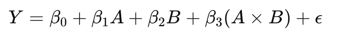
A*B는 A와 B의 개별 효과뿐만 아니라, 두 변수가 함께 작용할 때의 추가적인 효과를 모델링합니다.
A + B는 A와 B 모두를 독립 변수로 포함하되, 두 변수 간의 상호작용은 고려하지 않는다는 의미입니다.
* 연산자의 수학적 표현
선형 회귀 모델에서 A*B와 같은 상호작용은 다음과 같이 표현됩니다:
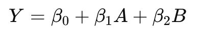
+ 연산자의 수학적 표현
선형 회귀 모델에서 A+B와 같은 상호작용은 다음과 같이 표현됩니다:

출발일까지 남은 일수를 +1로 변환 했을 때 ols_cate_pred.mean()의 결과는 -22.345731437757127 으로 전반적으로 판매량이 줄어든 것을 확인할 수 있었습니다.
import statsmodels.formula.api as smf

X = ["C(month)", "C(weekday)", "is_holiday"]
regr_cate = smf.ols(f"sales ~ days_until_departure*({'+'.join(X)})",
                     data=data).fit()
ols_cate_pred = (regr_cate.predict(data.assign(days_until_departure=data["days_until_departure"]+1))-regr_cate.predict(data))
ols_cate_pred
0      -23.466560
1      -21.594316
2      -22.022191
3      -22.354064
4      -20.555988
          ...
4383   -25.043533
4384   -23.171289
4385   -23.599165
4386   -23.931038
4387   -24.539522
Length: 4388, dtype: float64
테스트를 위해 2024년도 1월 1일 기점으로 훈련 데이터셋과 테스트 데이터 셋을 나누었습니다.
train = data.query("day<'2024-01-01'")
test = data.query("day>='2024-01-01'")
위에서 행했던 것과 동일하게 선형 회귀 모델을 생성했습니다.
Train 데이터 셋으로 모델을 생성했으며 평가는 Test 데이터 셋으로 진행했습니다.
cate_pred.mean()의 결과 값이 -21.899000381711396으로 이전 모델 값과 유사하게 나왔습니다.
import statsmodels.formula.api as smf
X = ["C(month)", "C(weekday)", "is_holiday"]
regr_model = smf.ols(f"sales ~ days_until_departure*({'+'.join(X)})",
                     data=train).fit()

# cate모델 생성
cate_pred = (
    regr_model.predict(test.assign(days_until_departure=test["days_until_departure"] + 1)) - regr_model.predict(test)
)
GradientBoostingRegressor 모델을 활용하여 예측을 진행 했습니다.
ml_pred.mean()의 결과 값이 4024.583542630549으로 값이 출력됐습니다.
from sklearn.ensemble import GradientBoostingRegressor
# ml 모델 생성
X = ["month", "weekday", "is_holiday", "days_until_departure"]
y = "sales"

np.random.seed(1)
ml_model = GradientBoostingRegressor(n_estimators=50).fit(train[X],
                                                          train[y])

ml_pred = ml_model.predict(test[X])
ml_pred는 머신러닝 모델이 생성한 예측값을 나타냅니다.cate_pred는 CATE 분석을 통해 얻은 처치값을 나타냅니다.rand_m_pred는 -1과 1 사이의 랜덤 값을 포함하여, 모델 예측과 무작위 값을 비교하거나 무작위 값을 기준으로 성능을 평가할 때 사용할 수 있습니다.# 난수모델 생성
np.random.seed(123)
test_pred = test.assign(
ml_pred=ml_pred,
cate_pred=cate_pred,
rand_m_pred=np.random.uniform(-1, 1, len(test)),
)
test_pred[["flight_id", "day", "sales",
           "ml_pred", "cate_pred", "rand_m_pred"]].head()
| flight_id | day | sales | ml_pred | cate_pred | rand_m_pred | |
|---|---|---|---|---|---|---|
| 730 | 0 | 2024-01-01 | 8506.89 | 9354.299561 | -26.633369 | 0.392938 |
| 731 | 0 | 2024-01-02 | 9774.08 | 7044.074577 | -24.678049 | -0.427721 |
| 732 | 0 | 2024-01-03 | 205.84 | 3617.266931 | -20.844695 | -0.546297 |
| 733 | 0 | 2024-01-04 | 4231.24 | 6709.930434 | -21.330786 | 0.102630 |
| 734 | 0 | 2024-01-05 | 10554.24 | 5542.606423 | -23.621338 | 0.438938 |
데이터에서 처치 변수 t와 결과 변수 y 사이의 효과 크기를 계산하는 effect 함수입니다.
from toolz import curry

@curry
def effect(data, y, t):
        return (np.sum((data[t] - data[t].mean())*data[y]) /
                np.sum((data[t] - data[t].mean())**2))
질문1. 위 코드에서 curry decorator를 사용하는 이유는 무엇일까요?
effect 함수의 인자 y와 t를 미리 고정하여 데이터를 그룹화한 후 각 그룹에 대해 처치 효과를 확인하기 위해서입니다.
데코레이터 예제
함수 add 는 두 개의 인자 a, b 를 받아 그 합을 반환합니다.
  from toolz import curry

  @curry
  def add(a, b):
  return a + b
이 예시에서 add(5) 는 a에 5를 고정한 새로운 함수를 반환합니다. 새로운 함수 add_five 는 이제 하나의 인자 b를 받아 원래 함수 add의 결과를 계산합니다.
  add_five = add(5)
  result = add_five(10)
  print(result)  # 출력: 15
effect_by_quantile 함수는 데이터프레임을 예측 변수의 분위수로 그룹화한 후, 각 그룹에 대해 처치 변수 t와 결과 변수 y 간의 효과 크기를 계산합니다.
def effect_by_quantile(df, pred, y, t, q=10):

    # 분위수에 대한 파티션 생성
    groups = np.round(pd.IntervalIndex(pd.qcut(df[pred], q=q)).mid, 2)

    return (df
            .assign(**{f"{pred}_quantile": groups})
            .groupby(f"{pred}_quantile")
            .apply(effect(y=y, t=t)))

effect_by_quantile(test_pred, "cate_pred", y="sales", t="days_until_departure")
cate_pred_quantile
-27.90   -24.543671
-24.97   -20.612043
-23.90   -24.285472
-22.87   -24.721743
-22.02   -20.476623
-21.38   -21.719096
-20.68   -23.167488
-19.92   -26.025323
-18.94   -21.810307
-17.24   -24.165002
dtype: float64
rand_m_pred, ml_pred, cate_pred에 대해 각 변수의 분위수 그룹별로 days_until_departure가 sales에 미치는 처치 효과를 시각화 했습니다.
import warnings
warnings.filterwarnings("ignore")

fig, axs = plt.subplots(1, 3, sharey=True, figsize=(15, 4))
for m, ax in zip(["rand_m_pred", "ml_pred", "cate_pred"], axs):
    effect_by_quantile(test_pred, m, "sales", "days_until_departure").plot.bar(ax=ax)
    ax.set_ylabel("Effect")
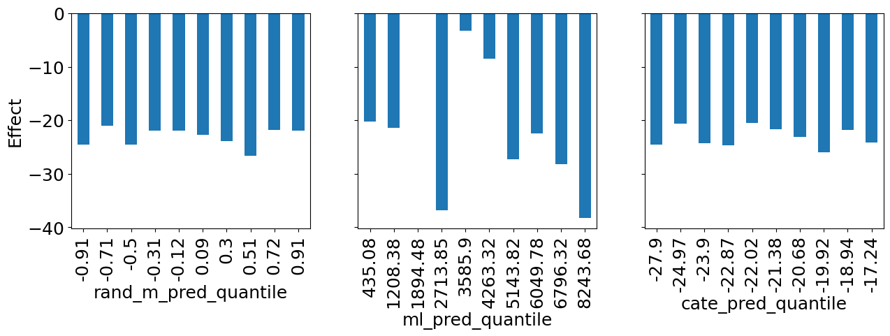
질문3 세 모델을 비교해봅시다. 어떤 모델을 사용하는게 가장 좋아보이나요? 그 이유는 무엇인가요?
ml_pred이 가장 좋아보입니다. 판매 예측이 매우 높거나 매우 낮을 때 더 많은
할인을 제공하는 방식으로 개인화에 활용할 수 있습니다
rand_m_pred는 개인화에 도움이 되지 못함
cate_pred는 계단형의 모습을 띄지 못함, 일반적으로 좋지 않은 모델
np.set_printoptions(linewidth=80, threshold=10)는 NumPy 배열 출력 시 한 줄에 최대 80문자까지 출력하고, 배열 원소가 10개를 초과할 경우 요약해서 출력하도록 설정합니다.
np.set_printoptions(*linewidth*=80, *threshold*=10)
cumulative_effect_curve 함수는 데이터셋을 예측값에 따라 정렬한 후, 각 단계별로 누적된 처치 효과를 계산하여 배열로 반환합니다.
def cumulative_effect_curve(dataset, prediction, y, t,
                            ascending=False, steps=100):
    size = len(dataset)
    # prediction 열을 기준으로 오름차순으로 정렬한 다음 인덱스 재설정
    ordered_df = (dataset
                  .sort_values(prediction, ascending=ascending)
                  .reset_index(drop=True))

    # 데이터셋 크기를 기반으로 단계를 계산하여 동일한 간격으로 데이터셋 나누기
    steps = np.linspace(size/steps, size, steps).round(0)

    return np.array([effect(ordered_df.query(f"index<={row}"), t=t, y=y)
                     for row in steps])
데이터셋을 cate_pred 열 기준으로 내림차순 정렬하고, 100개의 균등한 간격으로 나눈 단계별 인덱스를 계산하여 steps에 저장합니다.
# cumulative_effect_curve 분해해보기
size = len(test_pred)
ordered_df = (test_pred.sort_values("cate_pred", ascending=False).reset_index(drop=True))
steps = np.linspace(size/100, size, 100).round(0)
steps
array([ 15., 29., 44., ..., 1439., 1453., 1468.])
cate_pred로 정렬한 후, 단계별로 누적된 처치 효과를 sales에 대해 days_until_departure를 사용하여 계산합니다.
cumulative_effect_curve(test_pred, "cate_pred", "sales", "days_until_departure")
array([-29.73555067, -26.17120363, -25.1181167 , ..., -23.21318526,
       -23.19028933, -23.22382992])
이를 시각화 합니다.
plt.figure(figsize=(10,4))

for m in ["rand_m_pred", "ml_pred", "cate_pred"]:
    cumu_effect = cumulative_effect_curve(test_pred, m, "sales", "days_until_departure", steps=100)
    x = np.array(range(len(cumu_effect)))
    plt.plot(100*(x/x.max()), cumu_effect, label=m)

plt.hlines(effect(test_pred, "sales", "days_until_departure"), 0, 100, linestyles="--", color="black", label="Avg. Effect.")
plt.xlabel("Top %")
plt.ylabel("Cumulative Effect")
plt.title("Cumulative Effect Curve")
plt.legend(fontsize=14)
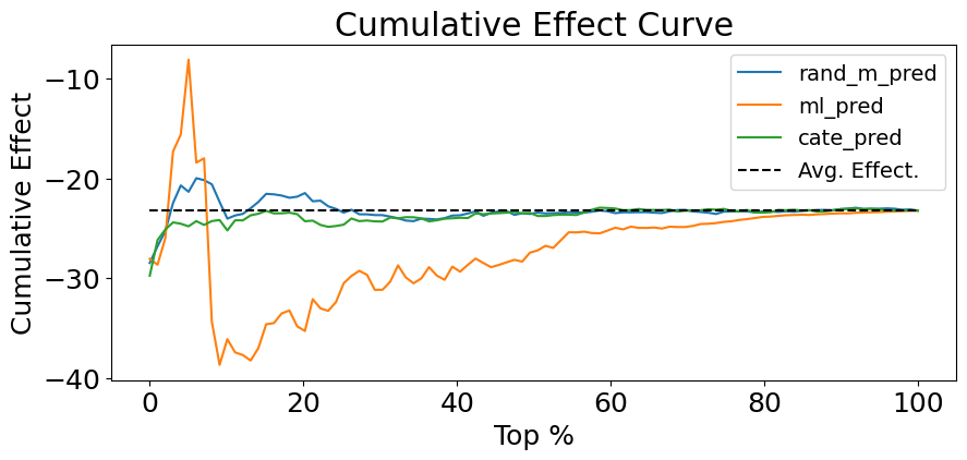
문제4. 위에서 만든 누적 효과 곡선을 통해 어떤 모델이 더 좋은 모델인지 생각해봅시다. 왜 그렇게 생각했나요?
책의 내용 : 반면, 잘못된 모델은 ATE 로 빠르게 수렴하거나 지속해서 그 주변에서 변동합니다**
ml모델이 좋아 보입니다. 초반 부분을 제외하고 구간별 처치의 특성을 잘 반영한 그래프입니다.
데이터를 예측 값에 따라 정렬하고, 각 단계별로 누적된 처치 효과를 계산하여 배열로 반환합니다.
def cumulative_gain_curve(df, prediction, y, t,
                          ascending=False, normalize=False, steps=100):

    effect_fn = effect(t=t, y=y)
    normalizer = effect_fn(df) if normalize else 0

    size = len(df)
    ordered_df = (df
                  .sort_values(prediction, ascending=ascending)
                  .reset_index(drop=True))

    steps = np.linspace(size/steps, size, steps).round(0)
    effects = [(effect_fn(ordered_df.query(f"index<={row}"))
                -normalizer)*(row/size)
               for row in steps]

    return np.array([0] + effects)

cumulative_gain_curve(test_pred, "cate_pred", "sales", "days_until_departure")
array([  0.        ,  -0.30383737,  -0.51700607, ..., -22.75461416,
       -22.95333133, -23.22382992])
첫 번째 그래프는 정규화되지 않은 누적 효과를, 두 번째 그래프는 정규화된 누적 효과를 보여줍니다
fig, (ax1, ax2) = plt.subplots(1, 2, figsize=(15,5))

for m in ["rand_m_pred", "ml_pred", "cate_pred"]:
    cumu_gain = cumulative_gain_curve(test_pred, m, "sales", "days_until_departure")
    x = np.array(range(len(cumu_gain)))
    ax1.plot(100*(x/x.max()), cumu_gain, label=m)

ax1.plot([0, 100], [0, effect(test_pred, "sales", "days_until_departure")], linestyle="--", label="Random Model", color="black")

ax1.set_xlabel("Top %")
ax1.set_ylabel("Cumulative Gain")
ax1.set_title("Cumulative Gain Curve")
ax1.legend()

for m in ["rand_m_pred", "ml_pred", "cate_pred"]:
    cumu_gain = cumulative_gain_curve(test_pred, m, "sales", "days_until_departure", normalize=True)
    x = np.array(range(len(cumu_gain)))
    ax2.plot(100*(x/x.max()), cumu_gain, label=m)

ax2.hlines(0, 0, 100, linestyle="--", label="Random Model", color="black")

ax2.set_xlabel("Top %")
ax2.set_ylabel("Cumulative Gain")
ax2.set_title("Cumulative Gain Curve (Normalized)")
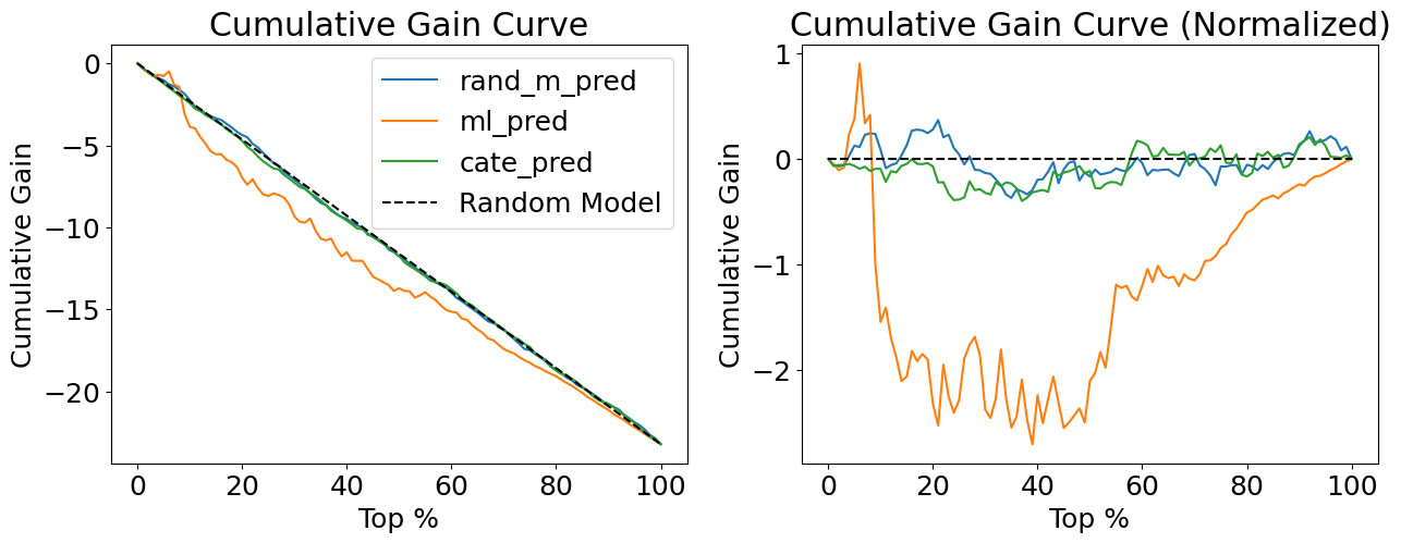
각 모델에 대해 정규화된 누적 효과 곡선을 계산하고, 그 곡선 아래 면적(AUC)을 구하여 모델의 성능을 평가합니다.
for m in ["rand_m_pred", "ml_pred", "cate_pred"]:
    gain = cumulative_gain_curve(test_pred, m,
                                 "sales", "days_until_departure", normalize=True)
    print(f"AUC for {m}:", sum(gain))
AUC for rand_m_pred: -2.5261370789266646
AUC for ml_pred: -126.17875765653183
AUC for cate_pred: -8.924177228497989
댓글